A while ago I was introduced to this by Manan (@shahlock) and meant to blog about it then – only a 4 month delay.
In 1973 the statistician Francis Anscombe published this paper concerning the importance of computer visualisations of data.
Computer technology has moved on, but his main point about the importance of visualising data as well as calculating summary statistics is still true today.
These 4 data sets, given below have many of the same common summary statistics:
- Mean of X
- Mean of Y (to two decimal places)
- The Variance of X
- The Variance of Y (to three decimal places)
- Correlation between X and Y in each case (to three decimal places)
- The linear regression line for each is \(\)y = 3.00 + 5.00x (to two and three decimal places respectively)
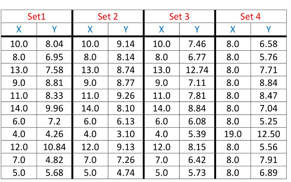
Being presented with just the sample statistics you could believe that the data sets are the same, or at the very least that the numbers are drawn from the same distribution.
However when you plot them, it becomes clear that the data sets are very different.

Quite often, presenting data visually seems to be overlooked as it is so easy to generate summary statistics but this classical example highlights the danger.
I’m planning on giving an exploration of this as an A-Level Homework at some point during the teaching of S1 this year, and have produced this sheet of prompts.