I am a bit late to the party here and despite having fairly recently updated to MATLAB R2016a I have only just noticed that graphics have changed in MATLAB (apparently this happened in release R2014b)!
Among other things the default colour order when plotting multiple functions has changed as has the colormap used in surf. But more excitingly it is now easier to modify things such as axis properties.
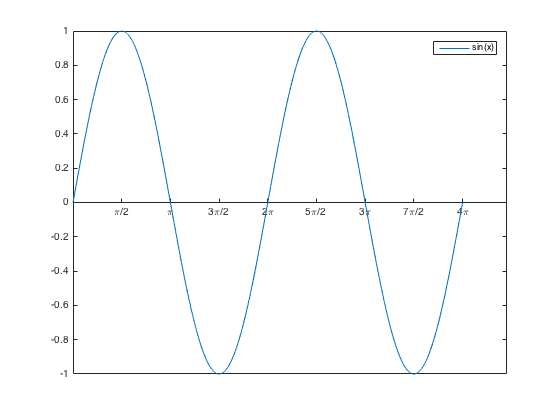
For example to produce the graph shown below (and featured in my previous post)
You only need the following few lines of code
Of course it always has been relatively easy to produce plots in MATLAB, the big change is that once I have access to the graphics object i can now use ‘dot’ notation to set properties, much like you would with a structure, or in a general object-oriented programming language. This looks so much cleaner than using the old style set syntax![]()
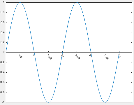
You can also now easily rotate the tick labels, for example you can modify the above plot to 
using the following simple command
I like these modifications and this has reminded me that I really should stay more up to date with the improvements that each new MATLAB release brings.
